|
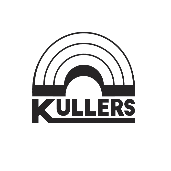
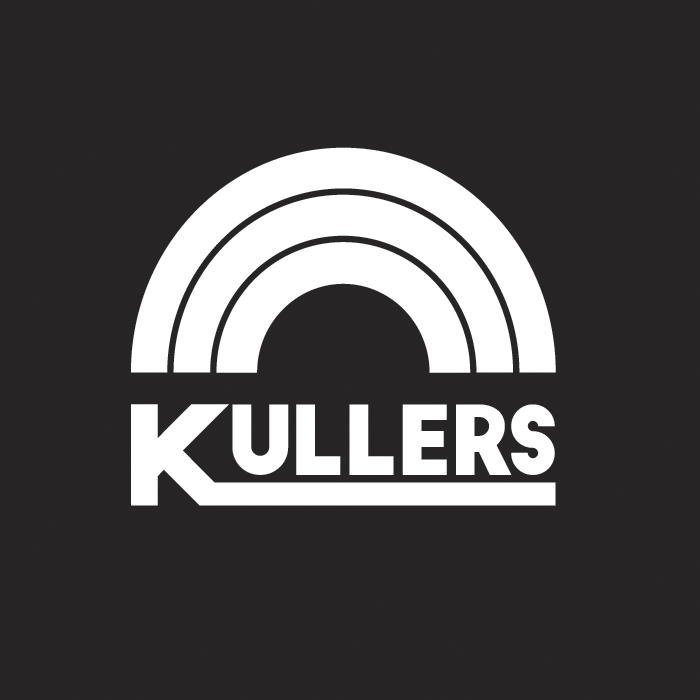
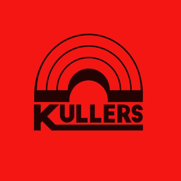
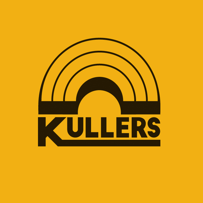
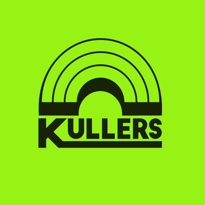
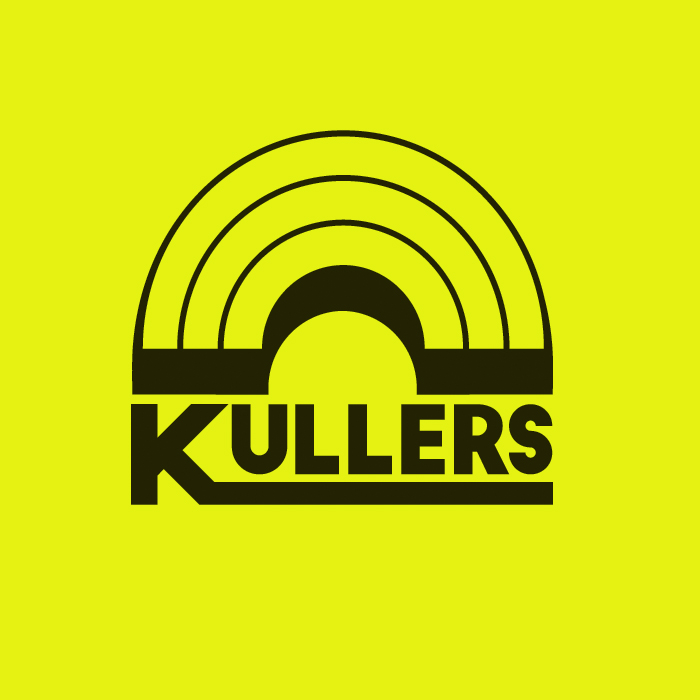
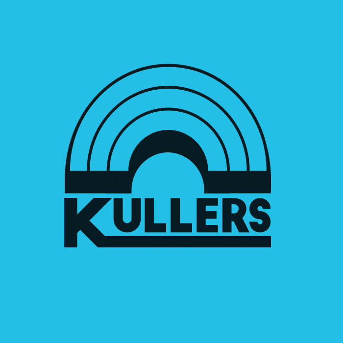
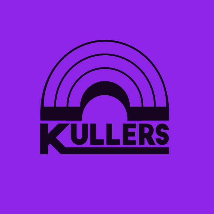
| K U L L E R S |Over the years Jordan has had many different projects that he has worked on but his new band, KULLERS, is a fresh start to new opportunities. I look forward to working more with his band and wish them the very best. Logo DevelopmentKULLERS is a colaboriation of musicians. I remember the day Jordan told me what his plans were for this band and the direction it was going. As we sat in the restaurant, we scribbeled out a few ideas and thought of a couple icons to describe the band. Even though we were doing all of this brain storming we were not landing on something. All we kept going back to is the fact that it needed to be colorful (hence KULLERS). The next thing I knew, I put the idea of a rainbow on the table. We both laughed, it seemed so simple and straight forward. As we talked more, the reasoning for the rainbow become more than just the classic arches of color that we all think of. So heres how it is broken down:
• Icon – Current with Design trends, simple and easily recognized without wording. • Color Treatment – Transparent, overlaps any colors chosen from the spectrum.
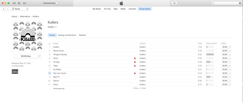
Album Art and Digital DistributionCreating the album art for this was pretty straight forward as the band really wanted to self title and promote the new look. This was designed for print and digital distribution with the intention to help the fans remember the logo and band name.
|
Connect with me |
||
© 2014-2017 All projects belong to Andy Valde. Images may not be reused or displayed without consent. Some student projects use stock photos from Ghetty Images that have been cleared by the Illinois Institute of Art — Schaumburg. |